Anthony Aiden Opticians
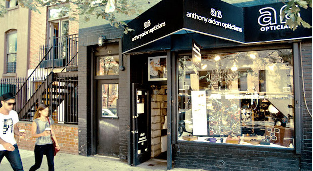
View of shop's storefront and awnings by
THE CHALLENGE: Creating a new identity for the rebranding of the 25-year-old "Myoptics" luxury eyewear boutique, to the newly named Anthony Aiden Opticians, proposed a few challenges.
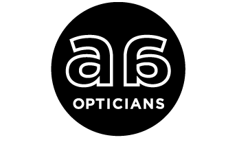
Anthony Aiden logo Design
THE CONCEPT: Not wanting to seem like another new addition to the already over-gentrified neighborhood, the logo was designed not only to convey the shop's main focal point (the double A's subtly created two eyes) but to also have a classic, iconic look that embodied "Old New York".
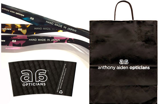
Anthony Aiden eyewear, bags and coffee cups sleeves.
THE STRATEGY: To gain super-recognition for the new logo, every visitor walked out with either a bag, a business-card, or an embossed leather case. Even double "A" coffee sleeves were dispensed at the neighboring coffee shop. Lens-clothes were patterned with it, stickers were stuck to packages with it. Right down to the tiniest temple pieces of their signature eyewear. All was engraved with the new logo.
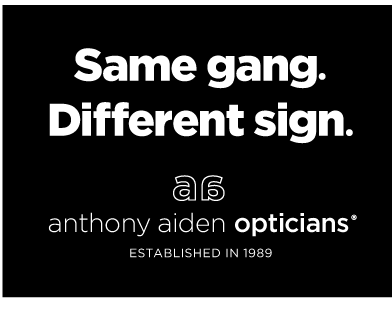
"Same gang. Different sign." Sign.
The second challenge was how to express that the new brand did not mean new ownership. In an attempt to not thwart off loyal customers, a simple sign with four words: "Same gang. Different sign" was created. This let people know at a glance it was still same downtown institution that they've loved since 1989.
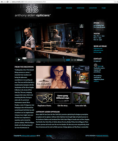
Web site design. Click here to view the full site
WEB DESIGN: Designed, developed and hand-coded their website using CSS, XHTML, and best SEO practices. Javascript allows the site to work quickly on multiple devices. This provided a good platform and paved the way to a strong online presence. Images of store's outer black brick facade is used as a design element continuing the store's look and feel throughout the site. "Stylish, informative, easy to navigate" has been some of the feedback.
Web ad for Anthony Aiden. Click to view.
COMMERCIAL DESIGN: Created this stylish yet raw and funny commercial as an additional marketing tool. By launching it on fashion blogs, social media and Youtube, it drew traffic and new interest. A clean "teaser" version of the film displayed on a loop in the shop's storefront window prompting viewers to see the full "too-hot" version on their site, this helped catch additional traffic to the Web site.
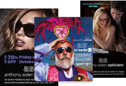
print ads for Anthony Aiden
ADVERTISING: Responsible for all print and online advertising. Full-page and quarter-page ads are regularly placed in Time Out New York and other publications.
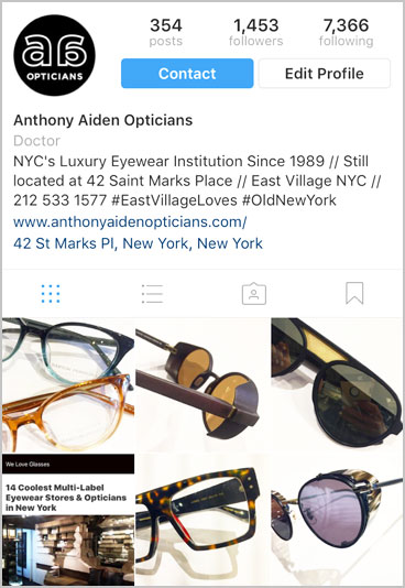
Instagram account for Anthony Aiden Opticians
SOCIAL MEDIA: Also responsible for all social media accounts. Photos of actual "in-stock" eyewear as well as other current events are regularly produced giving the brand even more traction. This brings more viewers to the Web site as well.